Color contributes to a bouquet's first visual impression, but it does not carry one fixed psychological meaning. Research on color and perception emphasizes that context, culture, age, task, and the specific shade can all change a response. On a screen, palette is one part of the reading experience alongside flower choice, card design, and the recipient's own associations.
The directions below are DigiBouquet's editorial design framework, not universal color meanings. Use color and bloom type as partners, then adjust for the person receiving the gift. If your recipient associates a color with a different mood, their interpretation matters more than this guide.
Decide the emotional temperature before you pick individual stems
For the examples in this guide, think of color as a temperature control for the bouquet. We use warm palettes for active, visible moments; soft palettes for close and reassuring notes; cool palettes for composed or reflective notes; and neutral palettes when the message should feel visually uncluttered. These are design choices within this site's palette, not predictions about every viewer.
| Palette direction | How it feels | Best for | Flowers that support it |
|---|---|---|---|
| Warm pink and red | Affectionate, visible, emotionally direct | Romance, anniversaries, close gratitude | Rose, Peony, Camellia |
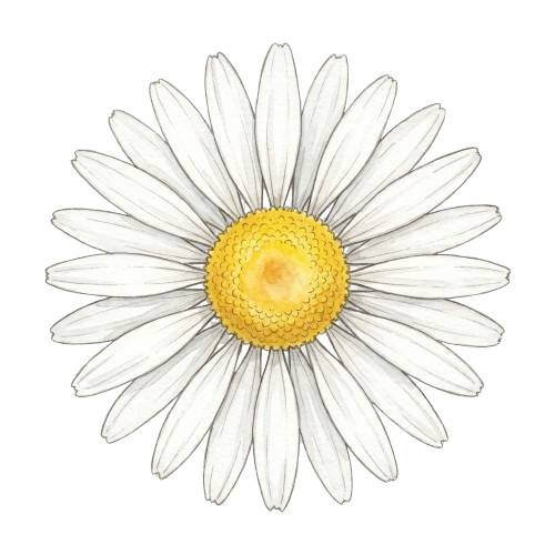
| Fresh yellow and light coral | Bright, conversational, optimistic | Birthdays, friendly support, congratulations | Tulip, Daisy |
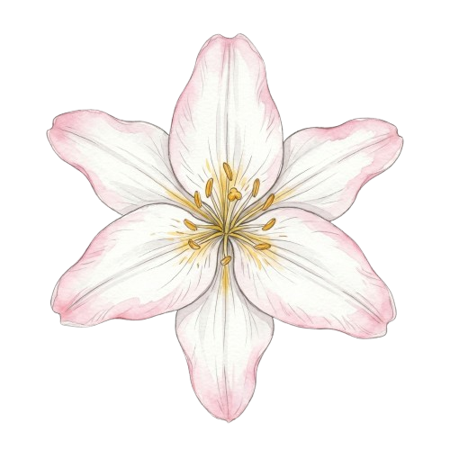
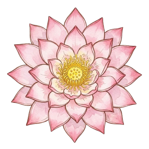
| White, cream, and pale green | Calm, spacious, respectful | Recovery, sympathy, reflection | Lily, Lotus |
| Orchid purple and deep magenta | Elevated, polished, admiring | Mentors, long-distance affection, refined romance | Orchid, Camellia |
Warm colors work when you want the bouquet to be noticed immediately
Warm reds, rich pinks, corals, and lively blushes create forward motion. They are useful when the bouquet should arrive with visible affection or celebration. That is why they work so well in anniversary bouquets, romantic check-ins, and close birthdays. A warm palette signals presence. It says the sender is not hiding behind politeness.
Warm colors are also effective when the recipient enjoys expressive gestures. Pair warm colors with roses or peonies if you want depth. Pair them with tulips if you want freshness and less intensity. The common mistake is using warm color saturation in messages that are actually about comfort. If someone is recovering, grieving, or overwhelmed, a hot palette can feel like emotional pressure instead of care.
Soft blush and pink palettes create closeness without too much drama
Soft pinks are the most flexible option on the site because they can support affection, gratitude, admiration, and gentle celebration. They are ideal when you want the bouquet to feel caring and intimate but not theatrical. This makes them useful for close friends, siblings, parents, early romantic relationships, and long-distance messages that should feel tender rather than intense.
Blush palettes also pair well with many card styles. On elegant or botanical cards, blush feels polished. On softer, handwritten-feeling cards, it reads as personal and warm. If you are unsure whether red is too much and yellow is too light, blush is usually the right middle path. It becomes especially effective when paired with camellias or peonies because those flowers naturally support warmth without sharp edges.
White and cream palettes help the message breathe
White and cream tones are important because they create silence in the design. They make a bouquet feel spacious, respectful, and unhurried. This is exactly what you want in sympathy, recovery, reflective encouragement, or moments where the written note carries emotional weight. White does not mean empty. It means the palette is giving the recipient room to receive the gesture without feeling crowded by it.
White-led palettes work best with lilies and lotus flowers because both blooms already support calm and dignity. Add a small amount of soft green or pale pink if you want the bouquet to feel less formal. The main mistake is using white when you actually want visible joy. In birthdays, flirtation, or playful affection, a white-heavy arrangement can feel too serious unless balanced by brighter notes.
Deep purple and magenta make admiration feel deliberate
Purple-adjacent palettes communicate refinement, admiration, and distance handled with care. They are excellent when the bouquet should feel intentional and elevated rather than spontaneous. This makes them strong for long-distance partners, mentors, collaborators, or recipients with more formal taste. Purple tells the viewer this bouquet was composed, not improvised.
Because purple can lean formal, it benefits from warmer support when the relationship is close. Pair it with softer pinks if you want admiration with intimacy. Keep it deeper and cleaner if you want respect and polish. Orchids do this naturally, especially when supported by camellias. The caution is obvious: if the recipient prefers playful warmth, a deep magenta palette can feel more elegant than affectionate.
Greenery controls pacing and balance more than people realize
Greenery is not just filler. In a digital bouquet, green tones slow the eye down and keep high-saturation colors from feeling crowded. If the bouquet uses rich pinks, reds, or purple accents, a little green gives the arrangement a calmer rhythm. This is especially useful when your message is heartfelt but you do not want the bouquet to feel visually loud.
Green also changes interpretation. A pink-and-cream bouquet with greenery feels grounded and mature. The same bouquet without green can read sweeter and more decorative. If you are trying to bridge two goals, such as warmth plus composure, greenery is often the easiest way to do it. This is one reason mixed bouquets tend to feel more usable than single-note palettes on the site.
Match the palette to the card style, not only the occasion
A bouquet is not viewed alone. The card template influences how colors land. Warm romantic palettes feel richer on elegant or midnight-style cards. Airier palettes feel better on botanical, soft, or lightly textured cards. If the note is short and warm, a soft card plus blush palette often reads more personal than a dramatic background with the same flowers.
The easiest mismatch to avoid is pairing a restrained message with a highly theatrical visual frame. If the note says, "Thinking of you and hoping things feel lighter soon," the palette should support gentleness, not spectacle. On the other hand, if the note is a milestone declaration, a more dramatic card can help the bouquet feel intentional. Card style should reinforce the same emotional register as the colors.
Color combinations that often misread the moment
- Bright celebratory mixes for grief, condolence, or hospital recovery.
- All-red romantic palettes for gratitude or professional appreciation.
- Very cool, muted palettes for playful birthdays that need visible joy.
- Deep elegant palettes for casual friendship when a lighter touch would feel truer.
- Too many saturated colors at once, which makes the bouquet look energetic even when the note is calm.
Palette directions that travel well across common gifting scenarios
For birthdays and congratulations, aim for light warmth: tulips, daisies, and a cheerful pink or coral direction. For romantic gifting, use pink-to-red gradients with either peony or rose leading, then soften with cream if the tone should stay intimate rather than dramatic. For gratitude, blush plus white or pale green often works better than pure yellow because it feels sincere without becoming childlike. For sympathy and recovery, white, cream, and soft green are usually the safest foundation.
If you still feel torn, work backward from the note. Ask which palette would make the first sentence feel more believable. The right palette does not compete with the message. It confirms it.
Read next
If you want to choose the lead bloom after choosing the palette, return to Flower Meanings. If you already know the colors and need help with wording, go to Digital Bouquet Message Ideas. For relationship-specific choices, use Romantic Bouquet Messages, Thank You Bouquet Ideas, or Get Well Soon Flowers when the palette needs to feel calmer and more restorative.